Two products, one build
Visitors need a clear explanation and an obvious next step. Staff need a safe way to keep that explanation true.
InvestED · Live
I redesigned how InvestED explains what it does, then built the WordPress system underneath it. The site is the part you can see. The part I care about more is that the staff can change a number, add an event, or swap out a form themselves — next year, without me.
What I walked into
InvestED came with a list of everything they wanted the site to do — impact figures that stay current everywhere, staff-run events and sponsors, a story library, a dozen hosted forms — and with two hard limits around it. The team had to be able to run it themselves once I was gone, and it had to be cheap to keep online. Most of my job was working out which of those three things actually had to give, and finding out that none of them did.
Visitors need a clear explanation and an obvious next step. Staff need a safe way to keep that explanation true.
Impact figures, events, reports, sponsors, people, and hosted form URLs all change on different schedules.
Routine edits could not depend on anyone remembering how a custom theme was wired together. Me included.
How I worked
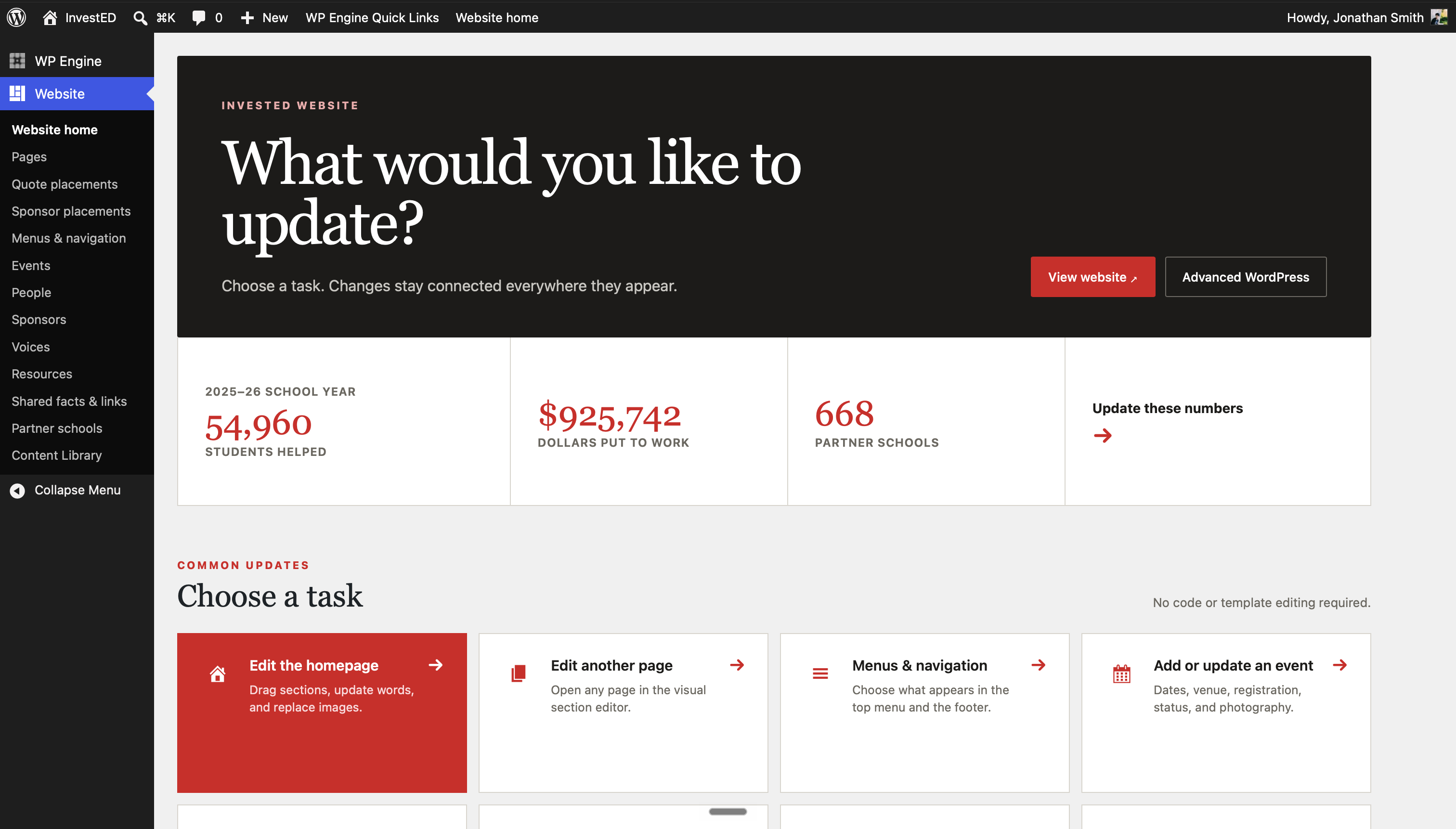
I mapped the visitor path and the staff jobs at the same time. On the site, the order is the barrier, then help arriving, then what changed. Behind it, anything likely to move became a structured field, a record staff edit once, or a task on their home screen.
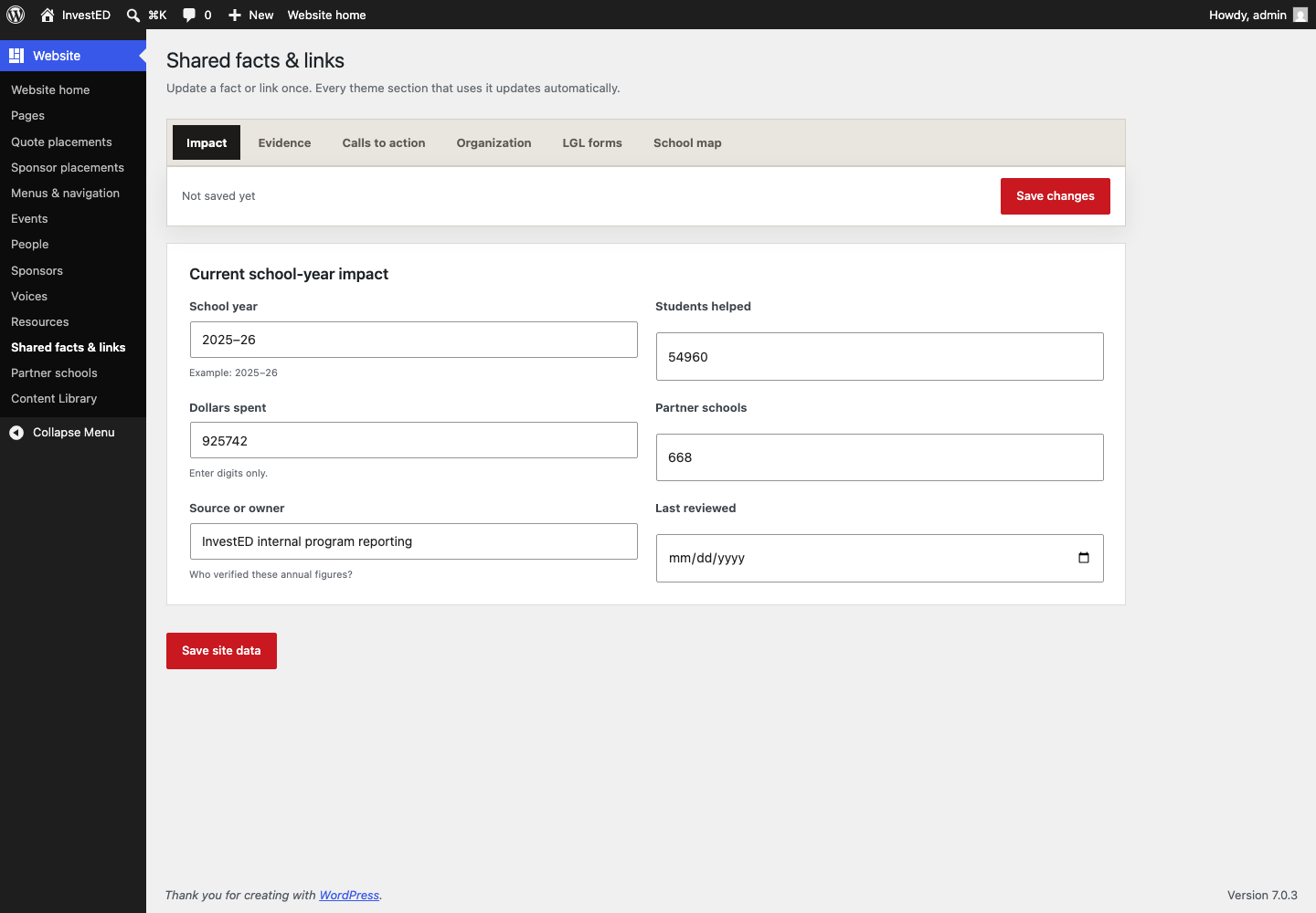
The screen every number on the site comes from
One place, everywhere
Change a figure here and it updates on every page that prints it, including the announcement bar.
A named owner
Who verified these numbers is a field, because “where did this come from” is the first question anyone asks.
A review date
A number with no expiry quietly goes stale on the homepage and nobody notices.
Content architecture
Understand
Trust
Act
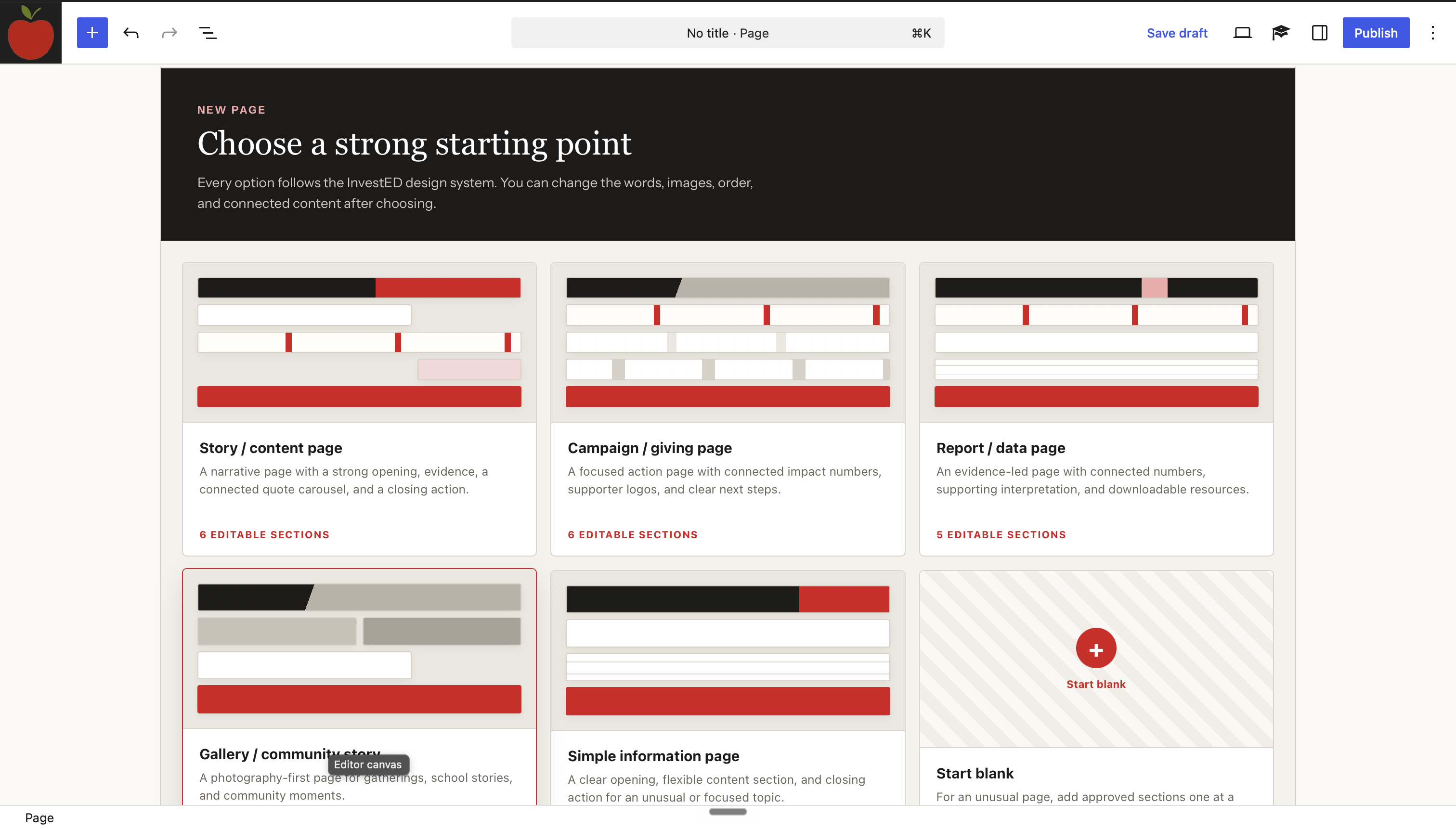
Staff pick a story, campaign, report, gallery, or plain information starter. Each one already follows the design system, and every section inside it stays editable. Nobody begins at a blank white screen and improvises a layout.
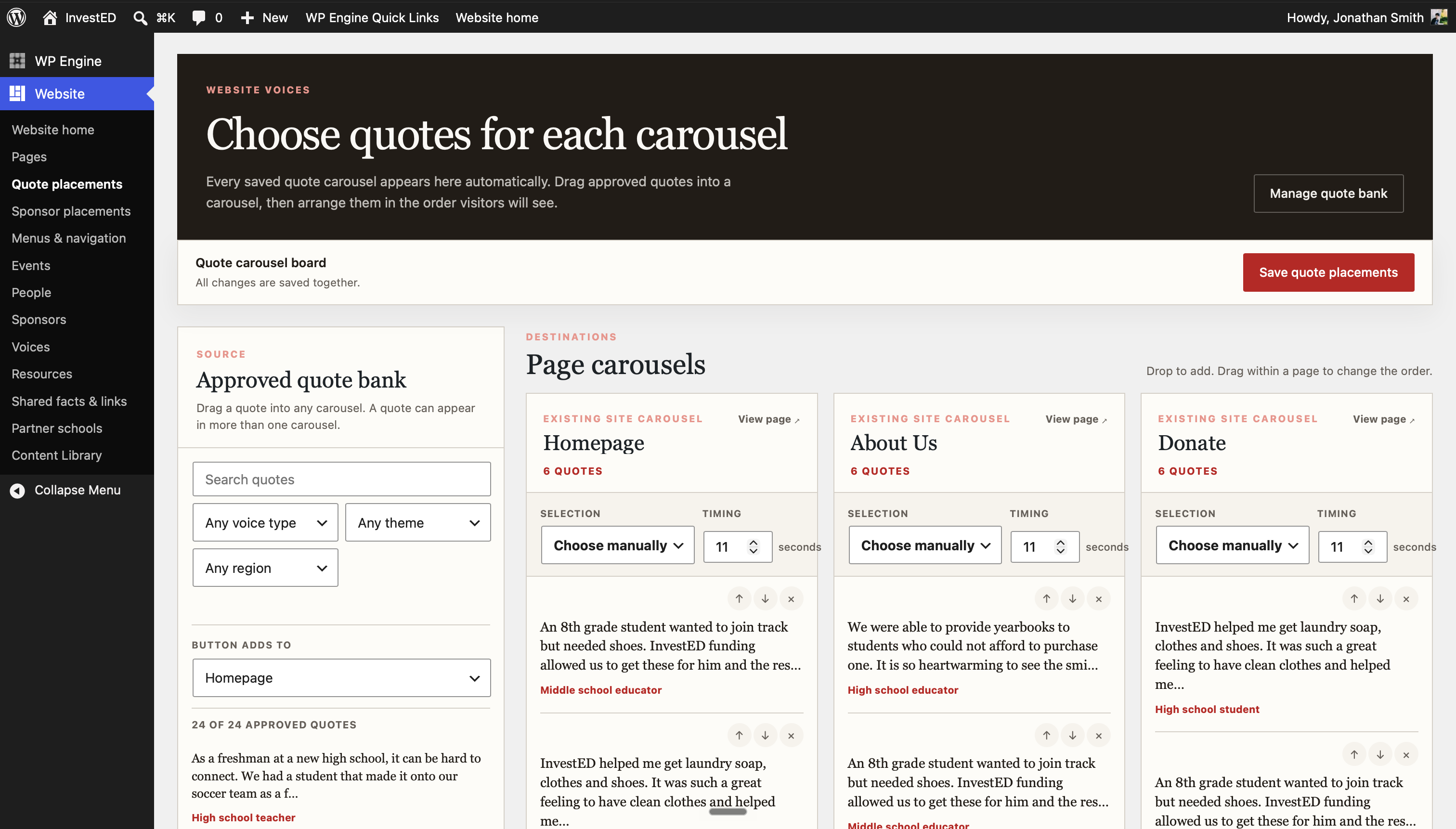
Approved quotes live in one list. Staff filter it, place a quote on a page, set the order and how long it holds, and reuse it without making a second copy that can drift.
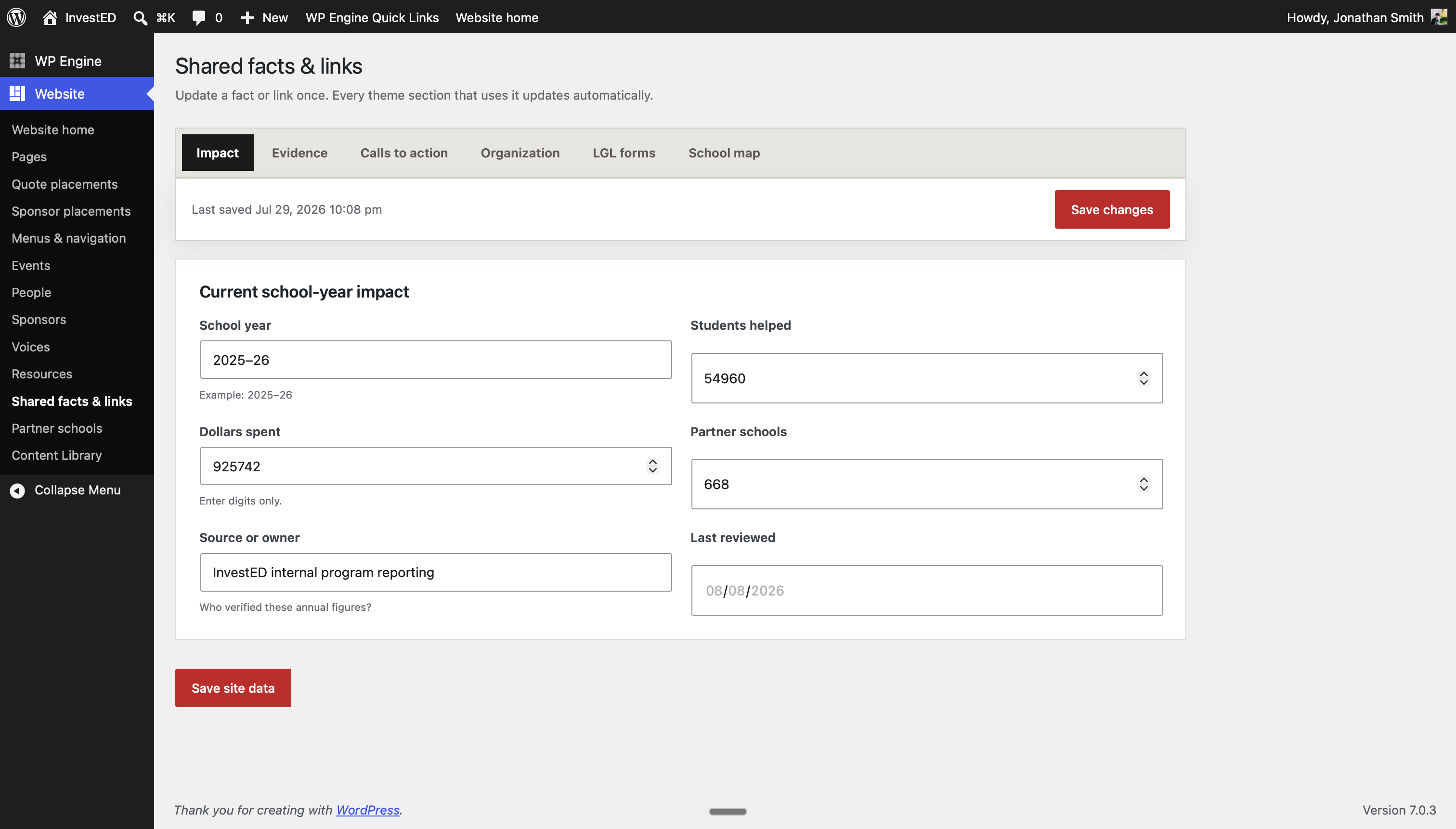
Annual figures have one home, one owner, and a review date. Change 54,960 here and it changes on every page that prints it, plus the bar across the top of the site.
The call that shaped everything
The brief arrived as a wish list — impact figures that update themselves everywhere, staff-managed events and sponsors, a library of stories, a dozen hosted forms — with two constraints attached: the team had to run it without a developer, and it had to be cheap to keep. They had already decided on Wix.
Wix would have given them the second constraint and quietly dropped most of the first. My job was to say so, and to bring an option rather than an objection. WordPress meant I could build them a custom admin — their own screens, their own language, a figure changed once and updated across every page — and nonprofit hosting rates made it cheaper to run than the platform they had picked. Same budget, none of the features cut. That one decision is why the rest of this project exists.
Every number and form link on the site lives on one settings screen. That screen was the promise — it is the reason staff would not need me. It was also silently throwing away every edit made on it, and it failed quietly enough that nobody would have reported it as broken — they would have assumed they had done it wrong. I caught it before handover by sitting down and using it the way they would, which is now the last step on anything I hand to someone else.
Give staff a blank page and they improvise a layout that drifts from the brand within a month. Lock it down and they cannot do their jobs and stop using it. The answer was starting points rather than restrictions: a story, a campaign, a report, a gallery. Every one already carries the design system, and every section inside stays editable. Nobody begins at a blank screen, and nobody has to ask permission.
Local previews are forgiving in ways a live site is not, and the problems that mattered only appeared once real content, a real host and a real phone were involved. I now treat launch as the point testing begins, not the point it ends.
What exists now
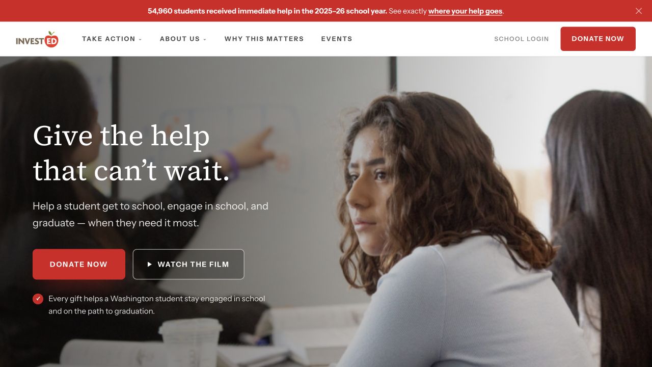
The live site connects the model, the current proof, and one clear next step. The part I am proudest of is behind the login. Staff open on “What would you like to update?”, click the thing they want to change, and get a field named after what it does — “Timeline entry · description”, not “Short text 3”. Full WordPress is one link away when they actually need it.
What the site reports for the 2025–26 school year. Staff type it in one place and it updates everywhere, down to the announcement bar.
Help reaches students through the school staff who already know them, so the site frames impact as a statewide system.
I am converting the last hand-built sections into real WordPress blocks so staff add and reorder things with the controls they already know. Sponsorship tiers went first.
What I carry forward
A bus pass. A lab fee. A pair of glasses. Naming what the money buys explains the model better than any sentence about helping students does.
That is what makes the editing screen part of the product rather than the leftovers. A number nobody can update is a number that goes stale on the homepage.
Every bug that mattered showed up on a real host with real content: pages my local preview had been quietly creating for me, defaults that never reached a saved site, a donation widget that only broke once someone opened it on a phone.